
AI Photography Tips
AI Skincare Product Photography: 10 Details Brands Must Get Right
Marjoni McBride · November 16, 2026
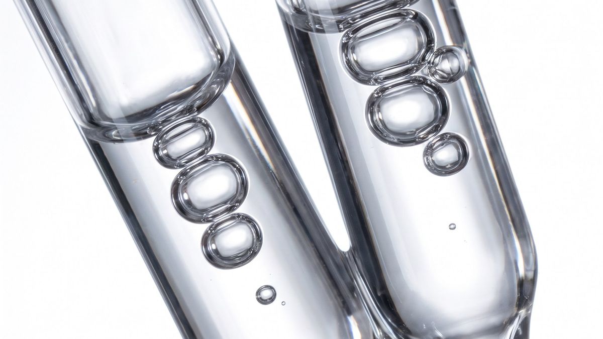
Skincare packaging looks simple until you have to reproduce it faithfully. Frosted glass, fine print, metallic caps, liquid color, and reflections all reveal tiny mistakes. When AI enters the workflow, those details become a quality-control priority.
Here are ten things to check before approving AI-assisted skincare photography.
1. The silhouette
Compare the original bottle, jar, or tube with the final artwork. Does the shoulder curve, neck width, and cap height remain correct? A beautiful shape that is not your actual packaging is still inaccurate.
2. Label copy
Zoom in. Text may be distorted or re-created incorrectly. For important labels, compositing the verified label artwork onto a carefully matched product image may be more reliable than asking a generator to invent perfect typography.
3. Product color
Amber is not the same as honey, and blush is not the same as peach. Record approved color references and compare them on a calibrated workflow where possible.
4. Container material
Glass, acrylic, polished metal, matte plastic, and paper have different responses to light. The finish is part of how people perceive quality.
5. Cap and closure
Small components are easy to overlook. Check droppers, pump nozzles, cap seams, threads, and the direction of the closure.
6. Surface reflections
A premium-looking image needs intentional highlights, not random shine. Ask where the key light is and what surface is reflected. Reflections should support the material rather than erase it.
7. Product-to-prop scale
A jar sitting beside a flower, a hand, or a stone provides context. Keep its size believable. Product scale should not change from frame to frame.
8. Texture and liquid behavior
Cream, serum, oil, mist, and water do not behave identically. Use actual product references and avoid showing an effect the product cannot deliver.
9. Claims implied by the image
Avoid visuals that suggest unverified results, ingredients, before-and-after changes, or performance. Creative atmosphere is valuable; misleading evidence is not.
10. Consistency across the campaign
The ecommerce image, editorial hero, vertical story, and banner should all show the same product. Review them as a group before approving the final exports.
My preferred order is product truth first, campaign mood second. The more accurate the starting reference, the more freedom there is to make the world around it cinematic.
Launching a skincare product? Bring your packaging references and desired campaign placements to Noir Label and let's build the visual plan around what you're actually selling.